Late to the Party as it has been a bit crazy around here lately. But I have managed to snatch some minutes here and there to relax with some interesting interior books and paint colour swatches over the last few weeks. Farrow and Ball launched their new colours in September and I have been enjoying all the colour inspiration in the sample tins they kindly sent me.
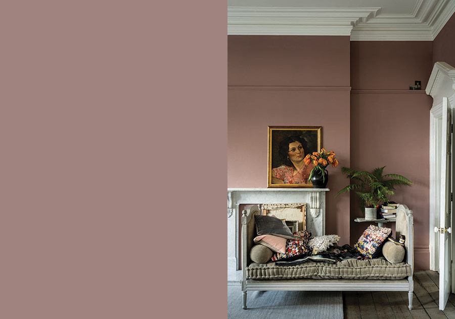
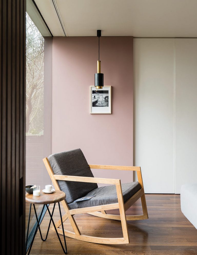
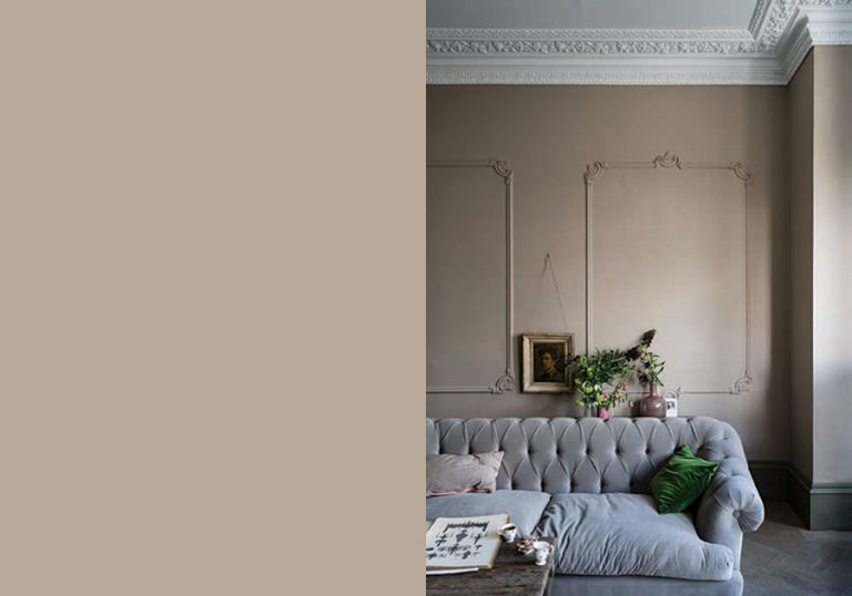
I am always on the lookout for a new pink and this – Sulking Room Pink – is a beauty. Dusky and soft it suits modern and period interiors as you can see in their lovely photos here. ‘Not to be seen as overtly pink, but rather a muted rose with enormous warmth, its powdery feel makes it incredibly soft and easy to use with complementary tones. Sulking Room Pink is evocative of the colours so often used in boudoirs, a room named after the French ‘bouder’ – to sulk’.
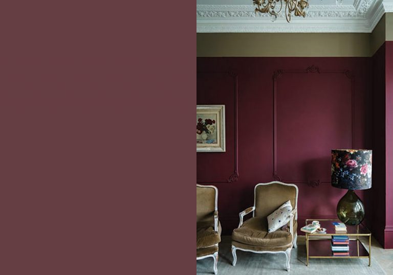
While we are on the warm scale – Preference Red – is a deep rich red, a Baroque colour it is named in honour of F&B’s original trade name, Preference Paints. ‘It can be used with any of the Red Based Neutrals but is particularly striking when seen in combination with Paean Black and Sulking Room Pink. The preferred red of modern homes’.
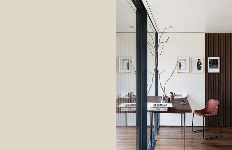
The lightest colour in the new collection this is School House White, I love this white it feels fresh and light, it’s on our list for the when the studio repaint gets underway. ‘Pared back, timeless and familiar without the cool undertones of the more contemporary neutral groups, this soft off-white is reminiscent of the colour used in old school houses’.
My favourite of the new palette is – Jitney – I fell for it as soon as I opened the box of paints and nailed the painted swatch up on the living room wall. We currently have Dimpse and although we love the colour it is now feeling a touch cold in our living room, the place we love to hunker down and cosy up – hence the craving to swap it for this is an earthy muted colour. F&B says ‘it is incredibly uplifting and reminds us of lazy days by the sea – hence sharing its name with the bus that whisks New Yorkers out of the hot city to the similarly coloured sandy beaches of the Hamptons’. My winner!
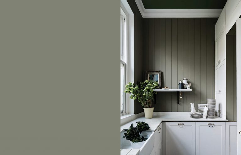
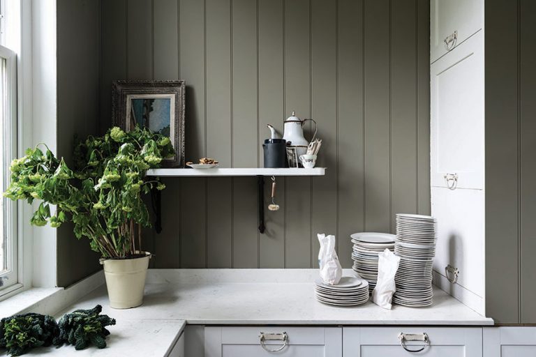
Treron – this enduring colour is a dark green version of Farrow & Ball’s classic Pigeon, hence being named after the green variety of the same species. ‘Although traditional in feel, Treron is perfect for modern homes where lots of natural materials are used or as an accent for both French Gray and our Traditional Neutrals’.
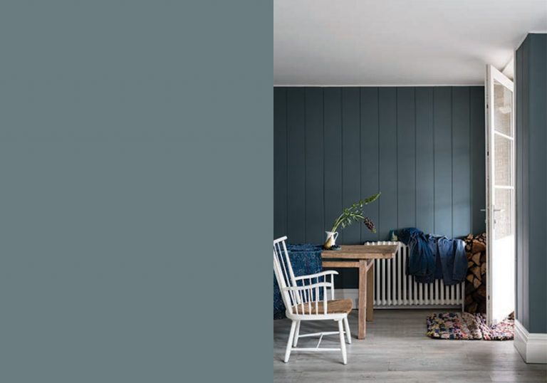
Finally, De Nimes – a quietly elegant blue that feels soft on the eyes and down to earth. F&B suggest ‘this could be used on anything from a kitchen island to an airy drawing room. The exact shade is rooted in a regency palette but is inspired by the cloth of everyday workwear made in the French city Nîmes. Like denim, its blue hue is ultimately fashionable and yet always feels grounded’. What do you think? Have a favourite?